
Using Bold and Dark Colours Without Shrinking a Room
Practical strategies to keep rooms feeling open when painting with dark or bold hues.
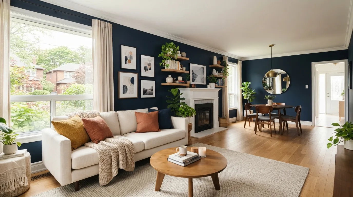
Can bold or dark colours make a room feel smaller — and how do you avoid that?
Yes, dark or saturated colours can make a space read as smaller, but careful choices about sheen, lighting, contrast, and balance allow you to use bold hues while preserving openness and depth.
Colour value versus saturation
Value (how light or dark a colour is) drives perceived room size more than hue. A deep navy with mid-tone accents reads less closing than a pitch-black wall because it preserves mid-value reference points the eye uses to judge space.
Sheen and finish matter
Low-sheen or matte finishes absorb light and reduce reflections, which can visually flatten a surface; a balanced approach uses matte on large fields and higher sheen on trim or features to introduce subtle light return and dimension.
Lighting is the equalizer
Natural light and layered artificial lighting change how dark colours read. East-west exposure, window size and the warm or cool quality of bulbs will alter contrast and depth, so plan lighting in tandem with paint choices.
Contrast and trim create perceived depth
Keeping ceilings or trim lighter than walls creates a visual frame that preserves vertical and horizontal cues. Even one lighter wall, tall baseboards, or a lighter ceiling can keep a bold room from feeling claustrophobic.
Step-by-Step: Using Bold and Dark Colours Without Shrinking a Room
Follow this practical sequence to choose colours, prepare your space, and apply paint so bold or dark hues enhance rather than shrink the room.
- 1
1. Assess the room’s light and architecture
Look at natural light direction, window size, ceiling height and how rooms connect. Note existing trim colour, flooring tone and fixed appliances—these are anchors for contrast and will influence which dark shades work.
- 2
2. Select a colour strategy: accent, full room, or feature ceiling
Decide whether you’ll paint just one wall as an accent, multiple walls, or try a dark ceiling. Accents are lowest risk; full-room dark paint needs stronger planning for lighting and trim contrast.
- 3
3. Choose finish and samples
Pick a primary finish—eg, matte or low-sheen for broad walls and a satin or semi-gloss for trim or built-ins. Paint large 2–3 square-foot samples and observe at different times of day before committing.
- 4
4. Plan and layer lighting
Add practical layered lighting: ambient overhead, task near work areas, and accent to highlight features. Use bulbs with appropriate colour temperature (2700K–3000K for warm, 3500K–4000K for neutral) to make dark pigments feel natural.
- 5
5. Prep and paint with contrast in mind
Prep surfaces, prime if switching from very light to very dark, and maintain crisp edges on trim or ceilings. Paint walls first if you’re using a lighter ceiling—this reduces the risk of touching up later and keeps the lighter plane visually dominant.
- 6
6. Evaluate and adjust decor
After paint cures (usually several days), assess with furniture and textiles in place and tweak by adding reflective accents, lighter rugs, or mirrors to bring depth and prevent the room from feeling boxed in.
Mistakes to Avoid
Using bold or dark colours has big visual impact, but common missteps can make a room feel smaller or flat. Avoid these mistakes and use the pro tips to keep the space feeling intentional and comfortable.
Skipping large samples
Small paint chips lie—colour shifts with light and surrounding finishes. Paint several large swatches on different walls and observe them at morning, afternoon and evening light before buying gallons.
Using only matte in poorly lit rooms
Matte finishes hide imperfections but can absorb too much light in dim spaces. If natural light is limited, introduce satin trim, glossy accents, or metallic fixtures to reflect light and create perceived depth.
Ignoring trim and ceiling contrast
Painting ceilings and trim the same dark colour as the walls removes visual boundaries. Keep trim or the ceiling lighter (even by a few shades) to preserve vertical cues and make the room read larger.
Overloading with saturated textiles and finishes
Layering too many saturated colours and heavy fabrics at once can overwhelm sightlines. Balance a dark wall with lighter textiles, glass or mirrored surfaces, and a restrained accent palette to maintain airiness.
What Affects Your Outcome
Several practical factors determine whether a dark or bold paint job makes a room feel open or closed.
Natural light availability
Rooms with large south- or west-facing windows generally handle deep pigments better than north-facing, dim rooms because they receive more direct and reflected light.
Ceiling height and room proportions
Higher ceilings and wider proportions tolerate darker colours more easily; low ceilings demand lighter ceilings or vertical accents to avoid a boxed feeling.
Paint sheen and application quality
Poorly applied dark paint will show roller marks and unevenness, which flattens depth; choosing the right sheen and hiring a skilled painter ensures even coverage and subtle reflections that preserve dimension.
Trim, flooring and fixed finishes
The value and colour of trim, baseboards and floors provide reference points. Light trim against dark walls creates perceived borders that keep spaces legible.
Furniture scale and textiles
Bulky, dark furniture next to dark walls increases visual mass; lighter upholstery or mixed materials (wood, metal, glass) break up planes and add depth.
Local climate and seasonal light shifts
In Ajax, ON and much of Durham Region, seasonal daylight changes—shorter winter days and low sun angles—make dark colours feel different across the year, so test samples seasonally if possible.
Frequently Asked Questions
Can I paint a small bedroom a dark colour and still make it feel cozy not cramped?
Yes—use a single dark accent wall rather than all four walls, keep the ceiling and trim lighter, and layer lighting (ambient, task, accent). Lighter bedding and reflective decor like mirrors add balance so the room feels warm rather than closed-in.
What sheen should I use with dark paints?
Use matte or low-sheen for most walls to hide imperfections, and satin or semi-gloss for trim and doors to reflect light. Avoid high-gloss across large fields because it highlights flaws and can produce harsh reflections.
Do I need to prime before switching from light to dark?
Yes—priming is strongly recommended when moving from a much lighter colour to a dark one. A good tinted primer reduces the number of topcoats, prevents uneven absorption, and improves final depth and coverage.
How does artificial light affect dark colours?
Warm bulbs (2700K–3000K) make dark colours feel richer and cozier; cooler bulbs (3500K–4000K) can push some pigments toward a dull or bluish cast. Use multiple layers of light and test bulbs in the painted room before finalizing fixtures.
Will dark paint hide wall imperfections?
Darker matte finishes can help hide minor imperfections by absorbing light, but they also emphasize texture when uneven. Proper surface preparation—sanding, patching and priming—still matters for a smooth result.
Are there any local considerations for homeowners in Ajax, ON?
Yes—Ajax homeowners should consider seasonal light changes and the typical house styles in Durham Region when choosing tones. If insurance or permits come into play for exterior colour or trim changes, verify requirements with your insurer and Whitby or Pickering permit offices as practices vary by municipality.
Free in-home colour and lighting assessment
Schedule a quick visit to see large colour samples in your light, get primer and finish recommendations, and a straightforward plan.
Get a Free Quote